Other Pokemon have undergone such changes, Pikachu being an obvious example:
Pikachu Then: Pikachu Now:

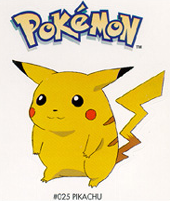


Honestly, I'm partial to old anime Pikachu or current Sugimori Pikachu. New anime Pikachu kinda rubs me all wrong. Also, I had saved all the old anime images many years ago back when the Pokemon still had conceptual names (see left). I thought I'd bust 'em out again to use here. Anyway, you see what I'm talking about. I will go into some details (ohhhh boy, get ready) over old and current designs and changes of Nidos from Sugimori, as well as the anime (which is about the worst reference you can use since anime Nidos are always off model).
Nidoran Female


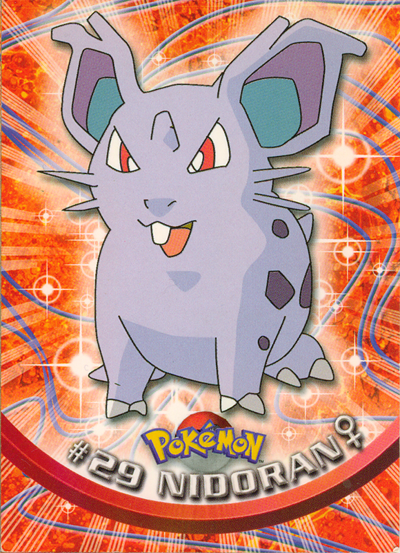

I won't speak for everyone who gives Nidoran Female a tail by mistake, but I suppose if you grew up with the first available set of artwork, you'd believe that she was supposed to have one. And now I know why she has one in Pokemon Pinball. She also has an extra spine, her horn rests more on the top of her head as opposed to just above her eyes, her whiskers are longer, and she has visible legs, kind of like Pikachu used to (but more natural here). The anime changed her design by making her into nearly one shape as opposed to two distinct ones, and all the other details we're all used to, now. Basically since the anime, she's taken a closer appearence to that, even in Sugimori's new art, so things haven't changed a whole lot (aside from Nidoran getting a bit rounder and a more pronounced nose). I guess he just went with what people were used to, but I kind of feel removing realistic hindlegs in an improved design isn't making things simpler, but lazier.
Nidorina


I don't even want to talk about Nidorina. It baffles me how the anime illustrators misinterpreted the original art. "Fatcute" Nidorina is the first Nidorina I got aquainted with, and am probably fortunate for it. When I first saw her, I felt like she was supposed to have that cute monster appeal like Bulbasaur, and could immediately see femininity, but then they fudged it all up. Let's start with Fatcute Nidorina. She's obviously wider than any other version. Her tail is also shorter. Because of the way her head is shaded, it gives the illusion that she has a bump on her head as if a horn would grow there (and that's why my character Nidorina has one), unless it's intentional, considering the position of old Nidoran's horn. Her ears have never really been consistant up until the final art so I'm not even going to talk about that.
Ugh. Then anime Nidorina. In theory her design's the same. They increased the size of the middle toe, but unfortunately that wasn't the only thing to get bigger. Her head, why is it so big? And longer, too? In her old design, her head and face appear more round and smooth, but she has more edges in the anime design. Her chin/lower jaw is much larger, her eyes are smaller and spread farther apart, her snout sticks out then flattens for some dastardly reason, and because of that long head, her ears aren't even in position. It's like they wanted to make her more like some kind of serpent, reptile, or dragon when she clearly isn't one, least not yet. In fact, that must be it. Why else would they alter her head and face so much? I'm willing to put money on the idea that the anime artists took the sprites from Red and Green verbatim and used that as a reference. It's so... unappealing, and it's this design that unfortunately most are used to because it's so wide spread, save for the trainer games themselves. The only good thing this design did was make her less fat and enlarge her tail.
Fortunately, oh thank GOD fortunately Sugimori didn't carry this design over, unlike Nidoran Female. Current Nidorina is basically the same as his earlier version, just with the large toe, slimmed down body and longer tail. The forehead's been color corrected, her ears streamlined, and her mouth is a little more pointed than it was before. She looks a little less friendly than Fatcute, but that's artistic license and means nothing. For one who doesn't want to bring up anime Nidorina, I sure did go on for a while, didn't I? It's just too bad even with his reworked art, they still use the anime design. And so does everyone else who doesn't know any better.
Nidoqueen


Nidoqueen's the least changed. That's good, because it means that the Sugimori hit the nail on the head the first time, and everyone else agreed. Nidoqueen trips me up in the same sense that Nidoran Female probably does others, because every time I looked at the current art, I always thought "I was so sure Nidoqueen had fangs". Now I remember where I saw them. The only other change from old version on is that she was smoothed off a bit (or a lot, depending on how you look at it, especially when you view her legs). The old anime version was a bit more stout with a longer head, but they corrected that rather quickly. Why can't they fix Nidorina and Nidorino like that?
Nidoran Male


Haha, when I look at the old Nidoran male, I can imagine someone coming up to Sugimori (and at a convention setting like Comic Con, no less, because it's even funnier) and asking "what does a male Nidoran look like", to which he responds by doodling something out of memory, half like he doesn't care, half like he honestly can't remember while slurring all his words together "Iunno--suhn'inlike'his--HERE". Don't get me wrong, the posing is more dynamic than any promtional art that's ever followed, but it looks like he just drew hills/waves around the ears at random (and yet, strangely precise). You can clearly see all four back spines for a change, but the adjacent spines along side the middle ones look more like an afterthought. Kind of like "these could go here, these could be removed, whatever guys, do what you want". And they seem more like patches than individual thorns. There's also a tail, and for some reason, he also only has one toe (which I admit used to confuse me to all heck, and more often than not I still drew two toes and prayed I was right).
When the anime came along, they doomed him into that pose forever, but his design seems a lot more complete and like they actually know what they want. He's cuter to a degree, maybe because his head is bigger. And maybe they forgot the tail, or lobbed it off, I dunno. Too bad they couldn't be consistant with this design even in their own show. In the Orange Island episode, Wherefore Art Thou, Pokemon, both Nidoran were recolors of EACH OTHER. I don't even know who's design they used as the standard, all they did right was the spike count and the ears (and even then...).
The current version is about the same as the anime, except proportionate, including facially. Again, maybe he went with this one because everyone was used to seeing it by this point. I notice he also has small fuzz on his hind leg (you'll want to click on the image to see it better). Maybe those original side spikes really were just a quill patch of some sort, draw your own conclusions. Not that it matters. No one draws Nidoran like that anymore, anyway.
Nidorino


The original Nidorino looked like he meant business. He also looks like Sugimori tried to make him as dynamically thorny as possible without really thinking about how that would affect the future. You'll see Nidoking is much worse. By dynamically thorny, I probably should mention I mean in a unique sense, in that his right ear differs from his left, and now I can see why early anime promo art carried this oddity over. It's really cool in a unique twist way, like Sneasel's mismatched ears. Usually, you want this kind of assymetry, but you also want to be reasonable about it, too. In this case it doesn't pan out, because animating little thorns is a pain, take my word for it. He also has a sixth spike, which explains why my Battle Museum Nidorino also has six, in this exact same pattern. Then again, I also have a large Nidorino battle figure with six spikes, but in the traditional pattern. Nidorino's upper jaw connects to his ear, which makes him look more like that toy I just mentioned. There's also something off about his hind legs, like it's not anatomically correct.
Anime Nidorino, at least promotionally, looks slightly less menacing. He's rounded off a bit too, except in the face, and in the spikes which for some reason became jagged. Just like Nidoran Male, though, it's too bad they couldn't keep this design consistant, it may have redeemed him. More often than not, Nidorino is off model. He's probably the most off model on the show. And I'm not talking the good off model that keeps characters lively and interesting, I'm talking "I don't know how to draw" off model.


The screen grabs from Wherefore Art Thou alone shows you that he had no consistancy, heck even in the same scene! And check his ears, and you'll see why having subtlely unique ears in animation is a bad idea. Granted, that entire episode is bad for Nidos in the artistic sense, they're always off model from scene to scene. But Nidorino goes beyond this and changes from episode to episode, too. And... wait, in that last shot, does Nidorina have a second row of spikes ala Nidoran Male? Oh for the love of... alright, I don't care what country you live in, THIS is why you should keep your animation in house. Outsourcing saves time my butt.
Anyway, anime Nidorino got shafted just as bad as anime Nidorina, arguably worse. Nidorina's just unappealing on the show, Nidorino has a doggone identity crisis. Sugimori's current Nidorino still doesn't look as menacing as the first, but he's still less bright eyed than the conceptual anime version. He's way better proportioned, though, streamlined for easier reproduction, and, dare I say it? He's actually the easiest version to draw! Maybe because it makes the most sense.
Nidoking


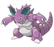
Wow, Nidoking got much friendlier looking over time. In fact, if I met the original Nidoking in person, I'd probably soil myself. He really does look like one bad mutha. And I can see why people who grew up with this art hold him in such high regard as a nasty lookin', all business Pokemon. I mean, the only other Pokemon that I think looked this hard in the Red & Green art is Mewtwo. And I'll tell you this, the overabunance of spikes help portray that angle. In a sense, Sugimori's early rendition reminds me of some fan art where amount of spikes is in direct correlation to the amount of manliness in Nidoking, so why not go for broke and draw in 22? I'm just kidding, if the fan art is good, it doesn't matter how many spikes someone draws. But still, it reminds me of someone adding more jagged teeth to a shark or dinosaur or something. His horn is also longer and has a bit more width, and his feet look like blades inserted into the soles of someone's shoes. When the anime promo came up, he got all dumpy. I doubt Japan has to worry about the PC Police but it does look like someone said "he's too mean~, tone him down~". Like Nidoqueen, they fixed this fast because... yeesh. The next phase in the anime design kept the simplified changes without making him look stupid. Or, at least less stupid. Current Nidoking is like current Nidorino. Not nearly as hard as the original version, based more on the simplified anime design, but still not as bright eyed. His body is also drawn in three clear parts, and is otherwise smoothed out a bit (although the torso area is a bit sketchy compared to other designs).
And so, there you have it. An article that drones on for far too long about details none of us really care about. It's plenty interesting however, especially in the cases of the Nidoran, how things changed from the earliest art we have to what we're familiar with today. Even more so because, as previously stated, this goes unnoticed more often than not. Besides, someone's gotta analyze this nonsense. If nothing else, hopefully this'll make you go "yeah, I can see that".
back to page 1